Presenting new knowledge in 1700 square inches
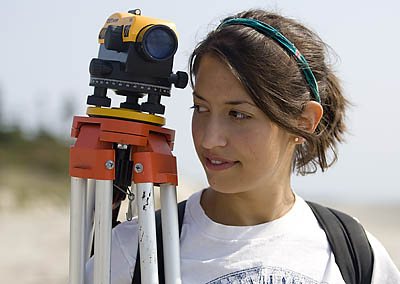
Dana Oster ’09 had to think big — Atlantic Ocean big — during her geology research on the ever-shifting sands of Seawall Beach, part of the Bates–Morse Mountain Conservation Area along the Maine coast.
But when it came time to explain her findings at a Maine conference last year, her ideas had to fit on a 3-by-4-foot poster.
“A poster is a bit of an understatement as to how important I believe my research is,” says Oster, whose research poster won a $500 first prize during the University of Maine’s Climate Change 21 forum. “But it’s good for learning how to organize and present your research.”
In higher education, research posters have never been more ubiquitous. With professional gatherings drawing thousands of attendees, poster sessions meet the need to exchange new ideas. After all, “you can’t have 30,000 scientists at the conference of the Society for Neuroscience each giving a talk,” explains Greg Anderson, a member of the Bates biology department who helps coordinate student poster efforts.
Bates students presented just 17 posters during the inaugural year of the Mount David Summit, in 2002. This year, the number has been capped at 110.
True, there are more posters because there’s more student research, plus it’s easier to produce a poster thanks to desktop-publishing software and wide-format printing. But there’s more.
Increasingly, students are expected to practice and master the presentation of their new knowledge. As biology professor Will Ambrose has said, “If the only people who understand your research are your co-researchers and your parents, then your work is simply less valuable.”
For students developing their public voices, “posters are the best way to have a conversation about your topic and get feedback about your ideas,” says Associate Professor of Biology Nancy Kleckner.
At Bates, the posters are getting better, too, thanks to expert advice from several corners. At the College’s Imaging Center, staffer Will Ash notes that students at first find it challenging to present their work visually. “They occupy the world of writers,” he explains. “They come to us with 50 pages of thesis that they are very attached to.”
Using more graphics and fewer words — and learning how to meld the two — are the keys to engaging viewers, who tend to be moving, distractible targets. “Creating a poster is an artistic endeavor,” Kleckner says.
When Ash and a student sit together at a computer with an open InDesign document, Ash is the one working the mouse, aiming to show “what’s out there, what’s possible,” he says. “I’m driving, but the student is the backseat driver telling me where to go,” he explains.
The hope, he says, is that the student’s aesthetic sense will kick in. “Seeing is believing when it comes to good design.”
By H. Jay Burns, photograph by Phyllis Graber Jensen


