Set to debut Nov. 3, the remodel of bates.edu was driven by mobile
A comprehensive remodel of the Bates website set to debut on Nov. 3 reflects the continuing sea change in how people are using the college website in 2014.
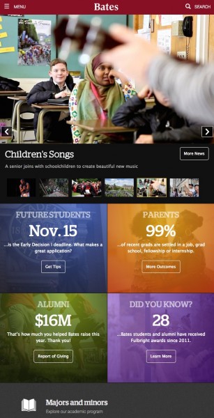
More and more, they’re going mobile, using smartphones or tablets.

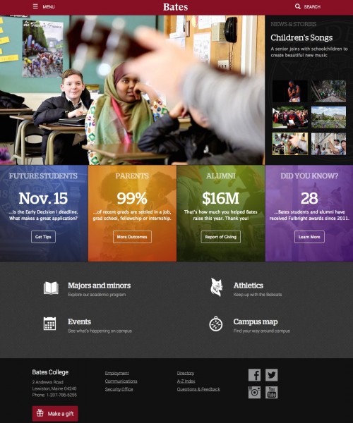
The remodeled Bates home page as it will appear to a desktop user. The remodel team’s use of “personas” inspired the creation of the four Audience Message Boxes geared to specific constituencies.
Two years ago, one in six visitors to bates.edu viewed the site on a mobile device. Now it’s nearly one in three.
While “mobile drove this remodel,” says Jeremy Cluchey, director of creative design for the Bates Communications Office, “the fact is, the trend toward greater mobile traffic is a worldwide reality.”
All about making a website that’s easier to use.
Ensuring that every website feature and piece of content renders well on tiny screens as well as big desktop monitors is as much a design and architectural challenge as it is a technical one, Cluchey says.
In that spirit, the new bates.edu incorporates a major homepage redesign and a new site-wide navigation menu, among other changes that, in the end, are all about making a website that’s easier to use for all visitors.
When it comes to website redesign, you need to know your users. And while 2.5 billion people worldwide are online, the Bates team zeroed in on just 12 users during the remodel process.
The 12 users, however, represent a conceptual twist: They’re “personas,” fictional people who represent the major public user groups of bates.edu.
To create the personas, a 12-person Usability Group, comprising staff from BCO and Information and Library Services, interviewed 50 Bates stakeholders from 16 college offices that communicate with various external audiences.
Their expertise informed the group’s understanding of the college’s many audiences and fueled the creation of the personas, the use of which is standard for usability projects, Cluchey explains.
“We’ve given each Bates persona a photo, a name, a hometown, and a set of specific attributes, including preferences, goals and top tasks for using the website,” Cluchey says. “We’ve created a list of do’s and don’ts for communicating with them. While they’re not real users, they could be.”
Diverse across gender, age, geography and race, and featuring various levels of engagement with Bates, the personas include prospective students and parents, current parents, alumni and non-Bates users such as a prospective staff member and a journalist.
For example, a persona representing an accepted student from Portland, Ore., wants to understand her financial aid package. The persona of a young alumna wants to network with other alumni and wants her opinion about Bates issues heard, while the Bates alumnus who’s also a Bates parent wants coordinated parent-alumni communications.
With this gallery of personas in hand, the BCO remodel team — Cluchey, Web Designer Barry Costa, Senior Digital Analyst Nicholas O’Brien and Web Designer/Developer Jake Paris — examined existing metrics and other user information, conducted campus listening sessions and implemented a website survey tool to “home in on the key concerns and priorities of our users,” Cluchey says.
Armed with a feedbag full of feedback, the group identified several major goals and set out to create solutions to meet them. Goals such as:
- Make the site fully usable to visitors regardless of one’s device, screen size or other technology, including Internet connection speed. The new site is fully responsive, featuring appropriate “break points” where the layout changes to meet the need of users’ various screen sizes.
- Update the site’s visual presentation in light of current industry trends and standards. That meant eliminating the old rotation of five full-screen images. “There’s reason to believe most users tune out those animations,” Cluchey says. “Metrics tell us that users don’t click on them as much as you think they might.” The new homepage features six major stories at all times, and the featured story changes randomly each time a user lands on the site. The new site also features an improved presentation of the ever-popular Bates slideshows.
- Use data to streamline the site’s navigation and to create clear and intuitive pathways to content. Here, the use of personas inspired the creation of “Audience Message Boxes” on the homepage, four differently hued rectangles geared to specific audiences and messages.
- Improve the site search so that it better serves users. Last summer, the Google-driven search function was improved so that results pages look more familiar and display much better on mobile devices.
Mobile behavior drove most of the other changes in the site’s navigation and architecture, says Cluchey. The old home page had a confusing tangle of menus that totaled 159 links. Of all those links, 20 received 80 percent of the click action.
To be sure, the number and placement of hyperlinks, especially in a site’s main navigation in prime real estate at the top of a page, is as much a political question as a web architecture one.
To answer those political questions in an apolitical way, the BCO remodel team asked four questions:
- What is being clicked? The top clicks included, for example, the course catalog, so it and other popular links stayed.
- What are visitors viewing that’s not in the menu? The popular “About Us” and Bates College Store are among those added to the new menu.
- What are the top tasks each persona needs to execute? Tasks like making a gift, knowing about campus events, using the alumni directory and finding admission information — top needs for many of the personas — continue to be doable in the new menu.
- Finally, what links should appear because they reflect institutional importance and values? Answering this question meant adding a link to the president’s office, among others.
After all was said and answered, the team was able to reduce the number of links in the new “drawer” navigation at the top of the page to just 30.

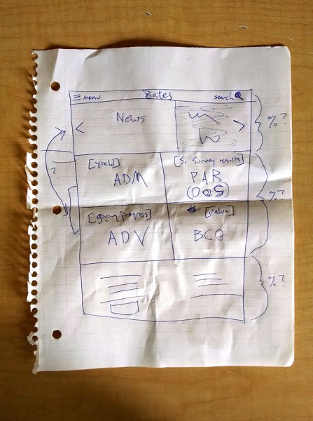
An early conceptual sketch of the remodeled home page suggests that when it comes to communications technology, paper still has its place!
While perhaps not within a single click from any given page, the rest of the site’s content is still easily findable.
As the group tweaked the site, they tested new features in various ways, including hallway testing with students in Commons and usability tests with alumni and other stakeholders.
That provided “great actionable feedback,” Cluchey says. “For example, it led to us to increase the size of the new menu bar and add clear headings to the new homepage elements.”
The remodeled website, still using WordPress for its content management, offers a freshened version of the award-winning major site redesign from 2011.
That redesign was a complete razing of the prior site and delivered vastly improved site-wide consistency, a better ability to track metrics and higher participation by campus offices, Cluchey says.


