Bates is best in higher-ed website competition
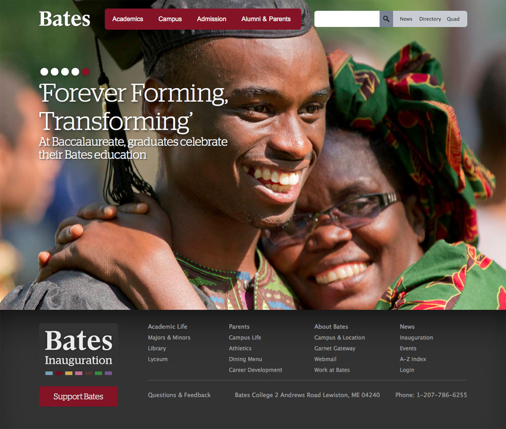
Redesigned in 2011, the Bates website has won top honors in a 2012 competition sponsored by eduStyle, a leading website for higher education Web design professionals.
The competition, featuring both judged and People’s Choice awards in each category, saw Bates win both awards for Best Overall Website, and the popular award for Best Home Page. The winners were announced at the eduWEB Conference on July 31 in Boston.
The eduStyle site is where higher education Web professionals “go to see what everyone else is doing,” says Ethan Wright-Magoon, digital creative director in the Bates Communications Office. In one sense, it’s the “best of the best of the best.” In another sense, the site lets “you riff on what others are doing, because we didn’t want a site that looks like every other.”
Wright-Magoon tells eduStyle that the new Bates site is more than a facelift. “We basically razed the online campus. Then we redesigned and rebuilt every site.”
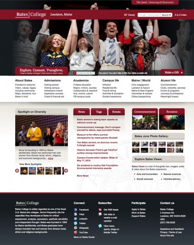
The Bates website, 1997–2012
The firm Tellart provited information architecture and strategy, then the Bates Communications webteam developed its look and feel, working in tandem with the college’s Information and Library Services’ systems and development team.
The site’s appeal begins with an “immersive” home page experience, says designer Chris Bournakis of Bates Communications. “This photo-driven experience allows the user to clearly understand what Bates is about.”
“And that feel continues throughout the site,” Wright-Magoon says. “The fact that Bates won best overall site and best home page speaks to that continuity. That was our goal, and we hit it.”
In terms of its content management system, the site is driven 100 percent by WordPress. Having a unified, site-wide CMS is “what leads to a consistent user experience,” Wright-Magoon says.
Webteam member Nicholas O’Brien says the site is especially effective in three areas.
Consistency
The 170-plus Bates websites hosted by the WordPress content management system all share a single design layout. “As users navigate across multiple sites, essential elements like the global navigation and site-specific navigation are always in the same place, and always behaving identically,” O’Brien says.
While not glamorous, a simple element like contact information is one of the most important parts of a website, he adds. “Nearly all of our 173 WordPress sites display the appropriate contact information in a consistent, prominent location.”
Inclusivity
“To date, every office or department willing to create content for the Web has received some form of technical and/or editorial support in getting that content online,” O’Brien says. “This inclusivity gives users an accurate idea of what Bates has to offer.”
Analytics
The WordPress-driven site yields bountiful analytics. “That, combined with data from phone calls, emails, and face-to-face questions, gives us an accurate picture of what our users would like to know and how well the website is helping them find that information,” O’Brien says.
Armed with actionable information, the webteam alters Bates websites often and with good reason: in response to users’ browsing behavior. “When a slightly altered webpage results in 20 fewer phone calls per week to a Bates department, we know that we’ve helped not only our users but our fellow employees as well.”


