The new homepage is different. Why?
In terms of the homepage strategy, we’re embracing the fact that while most people will pass through the homepage, the majority of their experience with bates.edu takes place deep within the website.
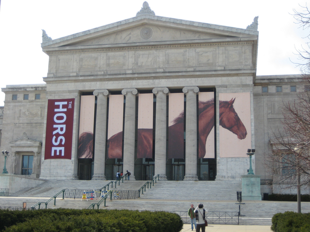
Compare the homepage strategy to that of a museum luring visitors inside. Is the Field Museum in Chicago obsessed with horses? Do they believe that nothing represents them better than a lone horse? No — their banner is simply a compelling story to draw people inside the museum to explore what’s going on. Similarly, we hope to lure visitors inside of bates.edu in the same way: by showing them a small portion of who we are and trusting that they’ll step forward.
But does it work? Let’s look at the Data.
The new homepage is unconventional in its relative simplicity. The irony of “less is more” is at play here, and we may not believe its virtue ourselves if it weren’t for the data. The old homepage, for example, had over 100 clickable links, and yet despite this huge variety, very few of those links received high traffic. The new homepage, on the other hand, has very few links, and many of them receive high traffic. This high traffic from the homepage into internal pages suggests that we are accomplishing the enticing effect we sought after.
Could the homepage drive traffic more effectively? Absolutely. And as feedback and data continues to role in, we will make informed changes and improvements as swiftly as possible.
